You start off with good intentions and a robust shopping list in your hands. You walk in with a purpose and determination to beautify your home. However, it only takes a few minutes, and you are distracted with other items that you can put inside your shopping bag. You feel lost in the maze of IKEA. And this happens every time!
Budget furniture giant IKEA lets its shoppers experience the journey of walking into labyrinth of furniture and home décor, and typically they walk out with more than what they anticipated.
Why is this so?
#1: TO ENCOURAGE IMPULSE SHOPPING
IKEA’s confusing layout delays the completion of the shopper’s list. It is designed to stop you from leaving. This emotional process disorients and dissociates shoppers from the outside world.
When they eventually figure out the space and start buying, shoppers feel licensed to treat themselves. By the time you find the stool that you are looking for, you will end up being so impressed by how cheap the table lamp is and end up getting it too. Alan Penn, a professor at University College London, said that this results in impulse buying.
#2: TO CREATE A WALK-THROUGH CATALOG
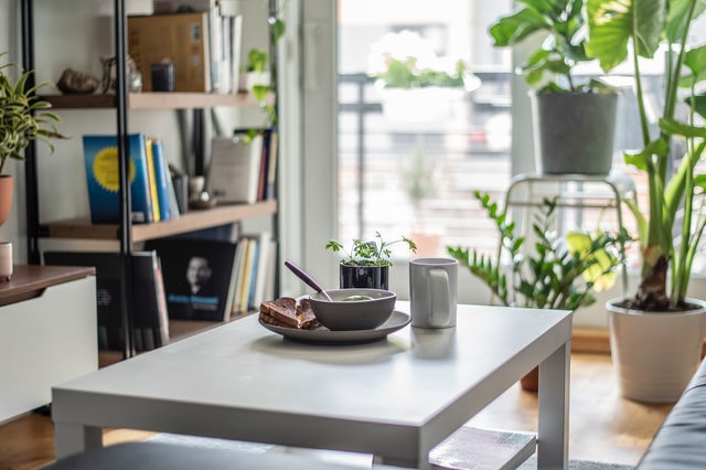
IKEA said goodbye to its printed catalogs after seven decades of publishing, but it does not mean that you cannot witness its pages in real life. Apart from delaying the completion of a shopper’s mission with its confusing layout, IKEA found a way to spend more time with its shoppers through its interactive spaces.
“Historically, we wanted the flow of our stores and presentation of the products to appear in the same way as they would in a catalog,” said Mr. Marcus Engman, the Chief Creative Officer for Ingka Group.

Image Credits: unsplash.com
#3: TO OVERWHELM YOUR SENSES
Consumer Psychology expert Paul Harrison highlighted that IKEA’s layout overwhelms the senses to stop shoppers from thinking about time and space. According to him: “We’re not very good at imagining. We look to others for ideas and IKEA’s store layout helps you imagine your ideal life, how life could be.”
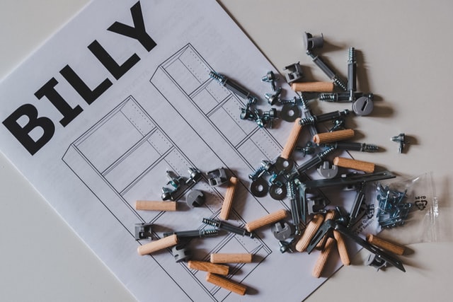
Cognitively, shoppers are not able to control their behavior and responses because they become more emotional. These emotions cascade to the process of building its products. You see, the furniture’s self-made concept provides shoppers with a sense of achievement.
#4: TO TRY NEW THINGS
Despite its popular maze-like layout, IKEA tried out other store formats last year. It tested two new formats to explore how physical locations can remain relevant in the age of e-commerce and amidst the pandemic.
Ingka Group, which operates most IKEA stores, reopened a location in Shanghai to test its new format. This format provides shoppers with other activities aside from shopping. Showrooms were introduced alongside a theater-like space where shoppers can hangout, a restaurant with sustainable food, and a Maker’s Hub where staff can help shoppers repair old items. This store represented its second test store.

Image Credits: unsplash.com
Can IKEA still amaze its shoppers even without its signature maze? Let’s see what the future of IKEA holds!


